- Part Two Chapter 05 – Mobile Friendly Website (Implement Mobile Website Strategies)
Part Two Chapter 05

How to Make a Website Mobile Friendly?
How to make a website mobile friendly? That’s really the question we’re going to find the answer(s) for when we’re to come up with the best solution for our mobile website strategy.
When developing your website for both mobile and desktop screens, you must choose a strategy. The three most common mobile website strategies are:
- Responsive Design
- Separate Mobile Website
- Dynamic Serving
In short, the three mobile website strategies differ in:
- The number of URL sets your website will use.
- The number of HTML code sets you will have to maintain for your website.
| Strategy | One Set of URLs | One Set of HTML Codes |
|---|---|---|
| Responsive Design | Yes | Yes |
| Separate Mobile Website | No | No |
| Dynamic Serving | Yes | No |
Responsive Design
Responsive web design is a mobile website strategy in which your web server always sends the same set of HTML codes to web browsers (of all devices) requesting your web pages. Your website's CSS is used to alter the rendering of the web page depending on the screen width of the specific device.
Whether a user visits your website on a desktop device or a mobile device, your website's URLs always stay the same. For example, when your website's homepage is displayed on a desktop screen:
www.example.com - desktop
When your website's homepage is shown on a mobile screen:
www.example.com - mobile
Configure Viewport
For a website with responsive design strategy to work, the prerequisite is to configure the viewport.
<meta name="viewport" content="width=device-width, initial-scale=1">
Examples
For example, both sites are using responsive design, and the web pages work on both mobile and desktop devices.
www.mobilewebsitebook.com
www.analyticsbook.org
Advantages
- Going forward, you will only have to maintain a single set of web page codes.
- You provide a single URL for a piece of content for both desktop and mobile users, but the layout of your web pages will self adjust depending on screen width (i.e. mobile or desktop screens).
- For mobile SEO, responsive web design is the recommended method. Google has put more weight on “mobile-first indexing” when ranking websites on the search engine results pages (SERP). i.e. Google takes the “mobile-version” of a website as the default version when ranking websites.
Disadvantages
- In order to have your web pages self adjust depending on different screen widths, you will need to have carefully designed CSS.
- Mobile users visiting your site may have to download the full-size images and files that are for desktop screens, and download the size-reduced images and files for mobile screens. This often ends up with increasing page load time while reducing web performance.
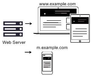
Separate Mobile Website
With separate mobile website strategy, your website uses two different URLs for mobile and desktop websites. i.e. One set of URLs for your mobile website, and another set of URLs for your desktop website.
Examples
For example, the homepage URLs of your websites:
www.example.com - desktop
m.example.com - mobile
For example, a page that displays a list of hotel of a specific city (e.g. Shanghai):
www.example.com/shanghai-hotels/ - desktop
m.example.com/shanghai-hotels/ - mobile
For example, a page that shows information of a specific hotel:
www.example.com/shanghai-hongqiao-number-one-hotel/ - desktop
m.example.com/shanghai-hongquao-number-one-hotel/ - mobile
For example, a sitemap page has links pointing to all other pages of the website:
www.example.com/sitemap/ - desktop
m.example.com/sitemap/ - mobile
For example, the forum homepage of the website:
www.example.com/forum/ - desktop
m.example.com/forum/ - mobile
Codes for Search Engines
According to Google, you can allow Google's organic search algorithm to better understand the structure of your separate mobile website by adding codes. For example, on the desktop version of your homepage you should include:
<link rel="alternate" media="only screen and (max-width: 640px)" href="http://m.example.com/">
On the mobile version of your homepage you should include:
<link rel="canonical" href="http://www.example.com/">
You should add similar codes to match both versions of all the pages of your website. For example, on the desktop version of your list page you should include:
<link rel="alternate" media="only screen and (max-width: 640px)" href="http://m.example.com/shanghai-hotels/">
On the mobile version of your list you should include:
<link rel="canonical" href="http://www.example.com/shanghai-hotels/">
Advantages
- Each website will have a distinct set of HTML codes and CSS that are device optimized (for user experience).
- When you have two separate sets of codes, you can improve web performance (i.e. speed) with device-specific optimized codes (without negatively affecting the other version).
Disadvantages
- Budget, development and maintenance will be more demanding as you always have to work with two sets of codes for your websites.
- For marketing, you can use a standalone set of mobile URLs for marketing or promotion to mobile users.
Dynamic Serving
With dynamic serving, your website renders different sets of HTML codes to mobile users and desktop users through a single set of URLs, depending on the user agent requesting the web page.
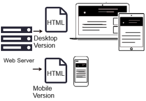
Whether a user visits your website on a desktop device or a mobile device, your website's URLs always stay the same. For example, when your website's homepage is displayed on a desktop screen:
www.example.com - desktop
When your website's homepage is shown on a mobile screen:
www.example.com - mobile
Vary HTTP Header
The prerequisite for dynamic serving to work is to configure the Vary HTTP header. The Vary HTTP header is part of the web server's response to a request, such as:
GET /page-1 HTTP/1.1
Host: www.example.com
(...rest of HTTP request headers...)

HTTP/1.1 200 OK
Content-Type: text/html
Vary: User-Agent
Content-Length: 5710
(... rest of HTTP response headers...)
The Vary HTTP header informs the web browser that the contents of the response will vary depending on the user agent that requests the web page.
Advantages
- You only have to maintain a single set of URLs for both mobile and desktop versions of your websites.
- You have two separate sets of codes, and can improve web performance (i.e. speed) with device-specific optimized codes (without negatively affecting the other version).
- A mobile user visiting your web page is only required to download the size-reduced images and files that are optimized for mobile screens/devices. This user doesn't have to download the other set of files that are optimized for desktop screens/devices.
Disadvantages
- You will have to maintain two different sets of HTML codes, CSS, JavaScript, etc, that are device-specific.
- For dynamic serving to work, you will have to configure Vary HTTP header. The configuration of the Vary HTTP header is operating system (or environment) dependent (i.e. IIS, Apache, Nginx, etc). To maintain the Vary HTTP configuration, you will be required to update the Vary HTTP header information across all operating systems.
How to Make an Existing Website Mobile Friendly?
To make a new website mobile friendly, you may implement one of the strategies: Responsive web design, separate websites, or dynamic serving. If one of your website’s main objectives is to do well with Google organic search ranking, then a website built with responsive web design will give you a great start.
But often you may be handed an existing website – A website that has already been created, and is up and running. Sometimes you’re inherited with old websites that have been running before year 2005. How do you make an existing website mobile friendly?
Assume your old website works well on desktop computers. If you’re to go for separate websites, then you’ll create a new website only for mobile users (to use on mobile devices). Disadvantages to this approach are that you’ll maintain two separate websites, and you’re going to optimize your new (mobile) website’s SEO or organic search engine ranking from the beginning (because it starts with no ranking).
The best option is to update your existing website with responsive web design (if possible). This way, your website will usually be benefited right away for mobile search on Google’s SERP. You’ll only have to maintain one version of your website at all time.
- Previous: Setup Web Hosting
- Next: Frontend JavaScript-based Framework: jQuery Mobile
Gordon Choi's Mobile Website Book has been available since November 2016.
Content on Gordon Choi's Mobile Website Book is licensed under the CC Attribution-Noncommercial 4.0 International license.

Gordon Choi’s Other Websites:
SEO Expert in Hong Kong (Gordon Choi’s Blog)
Analytics Book