- Part Two Chapter 06 – Frontend JavaScript-based Framework: jQuery Mobile
Part Two Chapter 06

The mobile web page will need CSS and JavaScript to take care of the presentation (visual layout) and the behavior (i.e. user interactions). We are going to implement one of the common JavaScript-based frontend frameworks, jQuery Mobile onto our mobile web pages.
Benefits of jQuery Mobile
The benefits include:
- jQuery Mobile is fully HTML5-based and is intended for developing web pages with responsive user interfaces that can be accessed well on all devices (i.e. mobile, tablet or desktop devices).
- jQuery Mobile makes developing mobile websites simple as it uses HTML5 and CSS3 for laying out mobile optimized web pages with minimal scripting.
How to Implement jQuery Mobile
We are going to create a simple mobile web page using jQuery mobile.
Add jQuery Mobile JavaScript and CSS Files
To use jQuery Mobile, we must add the following files in the head section.
<link rel="stylesheet" href="http://code.jquery.com/mobile/1.4.5/jquery.mobile-1.4.5.min.css" />
<script src="http://code.jquery.com/jquery-1.11.1.min.js"></script>
<script src="http://code.jquery.com/mobile/1.4.5/jquery.mobile-1.4.5.min.js"></script>
So the codes of mobile web page will become:
<!doctype html>
<html>
<head>
  <title></title>
  <meta charset="utf-8">
  <meta name="viewport" content="width=device-width, initial-scale=1">
  <link rel="stylesheet" href="http://code.jquery.com/mobile/1.4.5/jquery.mobile-1.4.5.min.css" />
  <lt;script src="http://code.jquery.com/jquery-1.11.1.min.js"></script>
  <script src="http://code.jquery.com/mobile/1.4.5/jquery.mobile-1.4.5.min.js"></script>
</head>
<body>
  <h1>...</h1>
  <p>...</p>
</body>
</html>
Define Pages
Define your mobile web page as “page” with the “data-role” attribute.
<div data-role="page">
  ...
</div>
Define Header
Define your header section as “header” with the “data-role” attribute.
<div data-role="header">
  <h1>...</h1>
</div>
Define Navigation Menu
Define a multi-tab navigation menu in the header section of the mobile web page by specifying “navbar” in the “data-role” attribute.
- All the tabs on the navigation menu are clickable buttons.
- Icons are included each of the tabs. For example, the home tab is represented by the text “Home” and the “home” icon (using the “data-icon” attribute”).
<div data-role="navbar">
  <ul>
    <li><a href="https://www.mobilewebsitebook.com/" data-icon="home">Home</a></li>
    <li><a href="https://www.analyticsbook.org/" data-icon="arrow-r">Analytics Book</a></li>
    <li><a href="https://www.gordonchoi.com/" data-icon="arrow-l">Gordon Choi</a></li>
  </ul>
</div>
Define Main Content
Define your main content section as “main” with the “data-role” attribute, and specify with the “ui-content” class.
<div data-role="main" class="ui-content">
  ...
</div>
Define Footer
Define your footer section as “footer” with the “data-role” attribute.
<div data-role="footer">
  ...
</div>
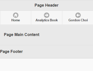
The Final jQuery Mobile Page
Let's put the jQuery mobile web page together.
<!doctype html>
<html>
<head>
  <title>Page Title</title>
  <meta charset="utf-8">
  <meta name="viewport" content="width=device-width, initial-scale=1">
  <link rel="stylesheet" href="http://code.jquery.com/mobile/1.4.5/jquery.mobile-1.4.5.min.css" />
  <script src="http://code.jquery.com/jquery-1.11.1.min.js"></script>
  <script src="http://code.jquery.com/mobile/1.4.5/jquery.mobile-1.4.5.min.js"></script>
</head>
<body>
  <div data-role="page">
    <div data-role="header">
      <h1>Page Header</h1>
        <div data-role="navbar">
          <ul>
            <li><a href="https://www.mobilewebsitebook.com/" data-icon="home">Home</a></li>
            <li><a href="https://www.analyticsbook.org/" data-icon="arrow-r">Analytics Book</a></li>
            <li><a href="https://www.gordonchoi.com/" data-icon="arrow-l">Gordon Choi</a></li>
         </ul>
         </div>
    </div>
    <div data-role="main" class="ui-content">
      <p>Page Main Content</p>
    </div>
    <div data-role="footer">
      <p>Page Footer</p>
    </div>
  </div>
</body>
</html>
- Previous: Implement Mobile Website Strategies
- Next: Develop WordPress Mobile Websites
Gordon Choi's Mobile Website Book has been available since November 2016.
Content on Gordon Choi's Mobile Website Book is licensed under the CC Attribution-Noncommercial 4.0 International license.

Gordon Choi’s Other Websites:
SEO Expert in Hong Kong (Gordon Choi’s Blog)
Analytics Book